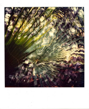
I sold my first limited edition photographs as a student in 1982. They were C-type prints, in the days when a C-type was still a C-type. At that time, it was a very much a pariah process, as the archival stability was suspect. Probably with good reason, as about 20 to 30 years was the estimated life span.

Polaroid SX-70 - Palm leaf at Kew from 1982. My first print sale. The original was copied onto colour negative film and then printed on agfa paper, producing an image approximately 15 inches square.
OK. What is a C-type? Remember the faded prints you used to see in the window of your local chemist, showing happy, smiling people on holiday? A C-type. Slightly faded is probably being generous – they were more than likely faded to the point where only the darkest elements of the prints remained, probably with a horrid blue cast – in my memory at least. They were prints made from colour negatives. They still are. Only now, with improved papers and chemistry, they have a much longer life span – maybe 150 years or more.
According to Wikipedia, the name was introduced by Kodak – as a Type-C in the 1950’s. Perhaps a slight variance depending on which side of the pond you are on, but nevertheless, an understandable term. Essentially, in common parlance, C-type prints are from colour negatives – and latterly from digital files. (The only difference with digital C-types is that the images will be scanned first, before being printed onto traditional style paper and developed.) In the UK, any professional lab would use this terminology – and they have done since I entered the profession in 1979.
So why the rant? I go to quite a few exhibitions, and I’ve noticed that the terms
Chromogenic print or
Colour Coupler print becoming more common. Not strictly incorrect, but it is a re-invention of the wheel. What’s wrong with plain English? I suppose it adds a bit of fluff to the description for customers in upmarket galleries who pay a lot of money for photographic images. In reality, it leads to confusion and something that ends up being meaningless. So if you see either of these terms…….it’s a bloody C-type!
Then came digital. And
inkjet printers. And inkjet prints. And the end of civilization. Only the term
Giclée could rescue us from the abyss.
Wikipedia’s definition: The word “giclée” is derived from the French language word “le gicleur” meaning “nozzle”, or more specifically “gicler” meaning “to squirt, spurt, or spray”.
I made my first inkjet prints in 1999, and I remember the term ‘Giclée’ being popular on photographic forums. It seemed to quickly fall out of use, and now most professional photographers in the UK refer to prints that come out of a digital printer, rather surprisingly, as an inkjet print. If it is printed on archivally stable paper, with archival inks, the term ‘archival inkjet print’ or ‘archival pigment print’ will probably be used.
Giclée is meaningless. Why the fluff? I went to a gallery two weeks ago, where some prints were listed as archival inkjet prints and others still referred to as Giclée’s. You need consistency and clarity. It’s like calling an oil painting a linseed and colour particulate image. A spade is a spade, a C-type is a C-type and an inkjet print is not a Giclée. Let’s leave the term for the high street and be done with it.
For further reading, have a look at
Jack Lowe’s website and blog. Originally a photographer, he is now one of the most respected printers in the UK, producing work for many photographers and artists. He sniggered at the term giclee, telling me that one of his assistants was French – and the term was a source of great amusement to him!


